PERSONAL PROJECT FOR SF RECREATION & PARKS
Redesigning a mobile
picnic reservation website


ROLE
Solo Product Designer
TIMELINE
Fall 2023, 5 weeks
THE PROBLEM SPACE
HMW streamline the process of reserving a picnic site to be more usable & customizable?
For a Product Design class at UC Berkeley, I redesigned the website for finding and reserving a picnic site in San Francisco. For this project, I was provided with a description of the user needs and business goals.
My objectives were to:
-
Increase the task completion rate
-
Reduce problems and cancellations
TARGET USER
-
English-speaking adult
-
San Francisco resident
-
Primarily uses mobile phone
USER NEEDS
-
Can easily select and reserve an appropriate picnic site
-
Can filter options by amenities and restrictions
BUSINESS GOALS
-
Increase booking completion rate & reduce cancellations
-
Convert users to online reservations to reduce costs
THE CURRENT WEBSITE
To start, I evaluated the current site using three methods.
USER INTERVIEWS
Participants
-
Three English-speaking adults
-
San Francisco residents
-
No prior experience with this process
Procedure
Interviewees were asked to find and book a picnic site given certain criteria (e.g. dates, amenities, restrictions). They were prompted to explain their thought process throughout the task.
HEURISTIC EVALUATION
This helped me identify usability issues and prioritize potential changes.


USER FLOW
Mapping the current user flow helped me define the start and end steps more concretely and determine how to consolidate steps.
PAIN POINTS
Users were experiencing three critical pain points.
01. IT WAS DIFFICULT TO FILTER SEARCH RESULTS.
"I'm not sure how to find a site that has a picnic table without opening each link, which will take forever."
02. BLOCKS OF TEXT WERE OVERWHELMING TO NEW USERS.
"When I first looked at it, it was hard to tell what I actually needed to read. I probably wouldn't read the whole thing."
03. PICNIC SITE AVAILABILITY WAS HARD TO FIND.
"I'm not sure why they put the availability on a different screen. Do I have to make an account to see it?"
Screenshots of the existing interface


IDEATION
So how did I address these issues?

CONCEPT SKETCHING
I picked the five most important aspects of the interface and sketched eight versions of each to explore design possibilities.
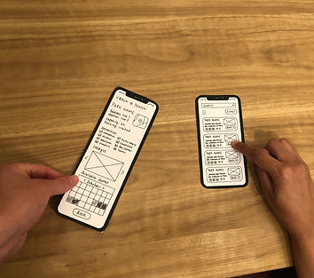
LOW-FI WIREFRAMING
I created a paper prototype and conducted three usability tests. From these, I learned that users found certain features (such as the reservation timing options) restrictive and not customizable.

DESIGN DECISIONS - PART 1

Picnic site search
and selection process
My objective was to reduce the amount of text, clarify call-to-actions, and maximize customizability. To achieve this, I added:
-
An accordion menu to present fees and regulations - a concise way for users to navigate content without feeling overwhelmed
-
Filters to find parks with certain amenities and availability
-
A new card layout for the picnic site directory, eliminating the need to navigate to a new page to find information
-
An availability calendar on the overview page for each site

Browse: List View

Browse: Map View

Filter Options

Park Details Page
DESIGN DECISIONS - PART 2
Reservation details questionnaire
The original reservation questionnaire was long. It required users to create accounts and answer hyper-specific questions irrelevant to many picnic hosts.
Here's what I changed:
-
Reduced steps by 40% by simplifying / combining questions
-
Replaced account creation with email code verification, streamlining the reservation procedure while boosting security measures
-
Numbered each step to indicate progress and provide a sense of accomplishment


Required Questions

Payment Information

Email Verification

Order Confirmation
OUTCOMES
The redesign successfully addressed key pain points.
Usability test participants reported a...
decrease in amount of time taken to complete a reservation.
50%
decrease in the number of steps required to book a picnic site.
40%
A QUOTE FROM A USABILITY TEST
"It's a lot easier to navigate now that I don't have to read as much. I love the icons - I can find what I'm looking for faster that way."
REFLECTION
This project was an exciting challenge and valuable experience as an emerging designer.
Being the sole product designer for this project taught me a lot. Looking back, here's what I think would strengthen this project.
More User Research
Since this was a class project, the problem space was defined for me. Conducting my own needfinding research would give me greater insight into typical use cases and constraints users experience.
Quantifying Impact
I'd like to explore ways to better quantify the impact of my design changes - perhaps through more in-depth usability testing or A/B testing.